LOCATION: Edinburgh, Scotland
ARCHITECT: Ian Burke & Martin (1964 Competition Entry); Elements completed by Hugh Martin & Partners following Ian Burke’s death
DATES: 1964-1973
NOTES: Currently under redevelopment, with proposed demolition in 2018
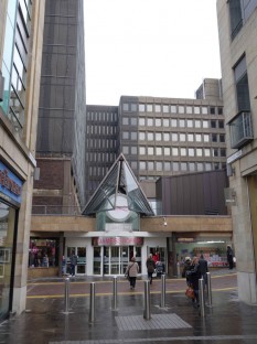
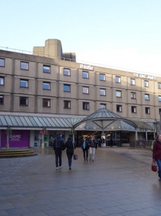
For such an expansive building, it was surprisingly tucked away. I came upon it through the Multrees Walk, a skinny pedestrian way lined with high-end shops in new glossy buildings. The St James sat at the end with its spiffed up entry way – whose malproportioned pyramid canopy only made things worse. This funny practice of adding a tech-style (with overscaled and gaudy hardware) glass awning and a few panels of granite to reclad the entry area would soon be revealed as a fairly common ad-hoc “strategy” for updating many buildings of this era.
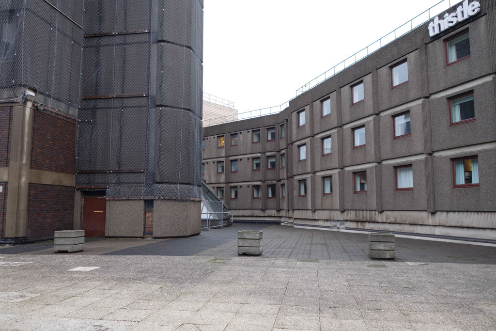
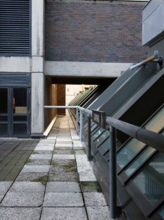
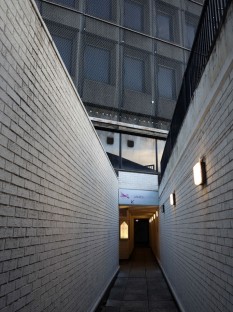
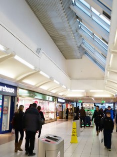
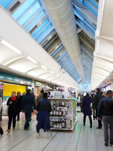
Upstairs where the out-of-use office towers sat, it was eerily quiet – just me and the pigeons. An entryway down to the shopping mall below was closed with a note explaining that high winds had made it unsafe to use. The emptiness and stillness of this plaza was in sharp contrast to the buzzingly crowded shopping centre below. The commercial spaces underneath the office plaza were strange nonetheless. The interior felt more like a series of endless corridors than any one real place. There was no real diversity of spatial scale, and the only notable distinction of space is thanks to the various awkward geometries of the skylights above.
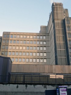
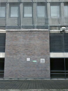
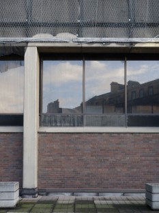
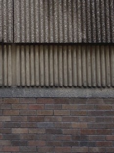
Perhaps the most compelling aspect of this site is what signals its eminent demise – the mesh wire wrapping much of the building. The two-layer wrapping, a netting with a wire mesh on top of it was apparently put in place in 2007 as talks for redevelopment began. Though any extensive information on the addition of this wire mesh has been hard to find – it seems the most consistent explanation is that it is a sort of pre-emptive protective cladding, a means to avoid the regular maintenance on the building’s facade. In a way, it’s almost as if they’re putting the building to bed before they tear it down. For the developers it may be an effort to forget about the building – or declare their future action to the building, but in truth, I found this added layer quite visually powerful.
EXTERIOR
- Entry off Multrees Walk with added canopy and granite paneling
- Entry off Princes Street with added canopy
MATERIAL COMPOSITION & DETAILS
INTERIOR
RELEVANT LINKS
http://blitzandblight.com/st-james-centre
http://www.edinburgharchitecture.co.uk/newtown-stjamescentre

